
Architectural photography verticals are a requirement, not a taste
When a design studio, retail brand or property owner commissions photography of a building in Japan from abroad, the images have a job to do: a portfolio page, a press kit, a franchise handbook, a listing. For that job, architectural photography verticals are not a stylistic preference. They are the condition under which a photograph can be trusted as a description of the space.
A building carries lines that someone designed. Columns stand vertical, ceiling trims run level, window mullions meet the floor at a right angle, and a site team held those lines to millimetres. Tilt the camera upward even slightly and the columns converge toward the top of the frame, recording a shape that was never built. For a practice publishing a completed project, or a brand documenting a store it will replicate, that is an error before anyone looks at the finish.
We have photographed property listings in the Kansai region since around 2015 and shifted our main focus to architecture and interiors in 2026. Here is how we handle lines on site, and how a client can judge it from abroad.
Not tilting the camera, in practice
There is one way to keep verticals vertical: hold the sensor plane perpendicular to the floor and never pitch the camera up or down.
On site, everything tempts you to break that rule: a double-height void, a floor pattern, a sign above a storefront. We move the camera instead of pitching it. For more ceiling the tripod goes up; for more floor it comes down. When the subject still does not fit, we shoot with extra room above or below and crop later. Software correction stretches the edges and discards part of the view, so we leave room at capture.
A tripod and a level are not optional. We use the camera’s electronic level and grid, pick one strong vertical near the frame edge, and confirm it runs parallel to that edge before every exposure. One leaning image makes a whole set look careless.
Where the lens sits decides the picture
Once tilting is off the table, composition collapses into one variable: lens height, which sets the split between floor and ceiling.
In residential and hospitality interiors we start a little below standing eye level, roughly 1.2 to 1.4 metres. Eye level gives too much ceiling; too low hides tabletops and shelf contents.
Retail adds a second reference: counter and shelf height. Place the lens where the top of the display shelving reads as a level line and the merchandise and the room settle together. The lens goes where people in that space actually look.
Straight-on or from the corner
The remaining choice is whether to face a wall squarely or shoot from a corner.
A frontal composition pulls the floor and ceiling lines toward the centre and makes the frame nearly symmetrical. It suits storefronts, fixtures seen head-on and studies of material and finish, and where the designer set a clear axis, facing it is an account of the design.
A diagonal composition shows depth and how two walls meet. It conveys size and shows where a visitor can walk next, which is why booking platforms and property listings lean on it.
We choose by destination. A practice’s project page starts from frontal frames with diagonals in support; a hotel or rental listing starts from diagonals for scale and adds frontal frames for texture. We learned to work backwards from the medium during the years we photographed for international booking and delivery platforms, where publishing requirements were specified in advance.
Retail interiors: choosing which lines to trust
Shops are harder than homes because there are too many lines: shelving, products, signage, lighting tracks, floor joints, glass frames. Not all can be aligned, so the first decision is which ones will be.
We look first for the lines the designer drew deliberately: ceiling trims, changes in flooring, the module of the wall panels. Next come the elements that make the store recognisable: the name sign, the fascia, the hero fixture.
What can never lean is the product itself, or anything the viewer knows is level, such as liquid in a glass. A row of bottles that appears to slope confesses the camera’s tilt.
Wide lenses add one more judgement. Fit an entire shop into one ultra-wide frame and the chairs and products near the edges stretch sideways, even with perfect verticals. We often narrow the field and split one frame into two so the product at the edge still looks like the product.
How to judge this from abroad
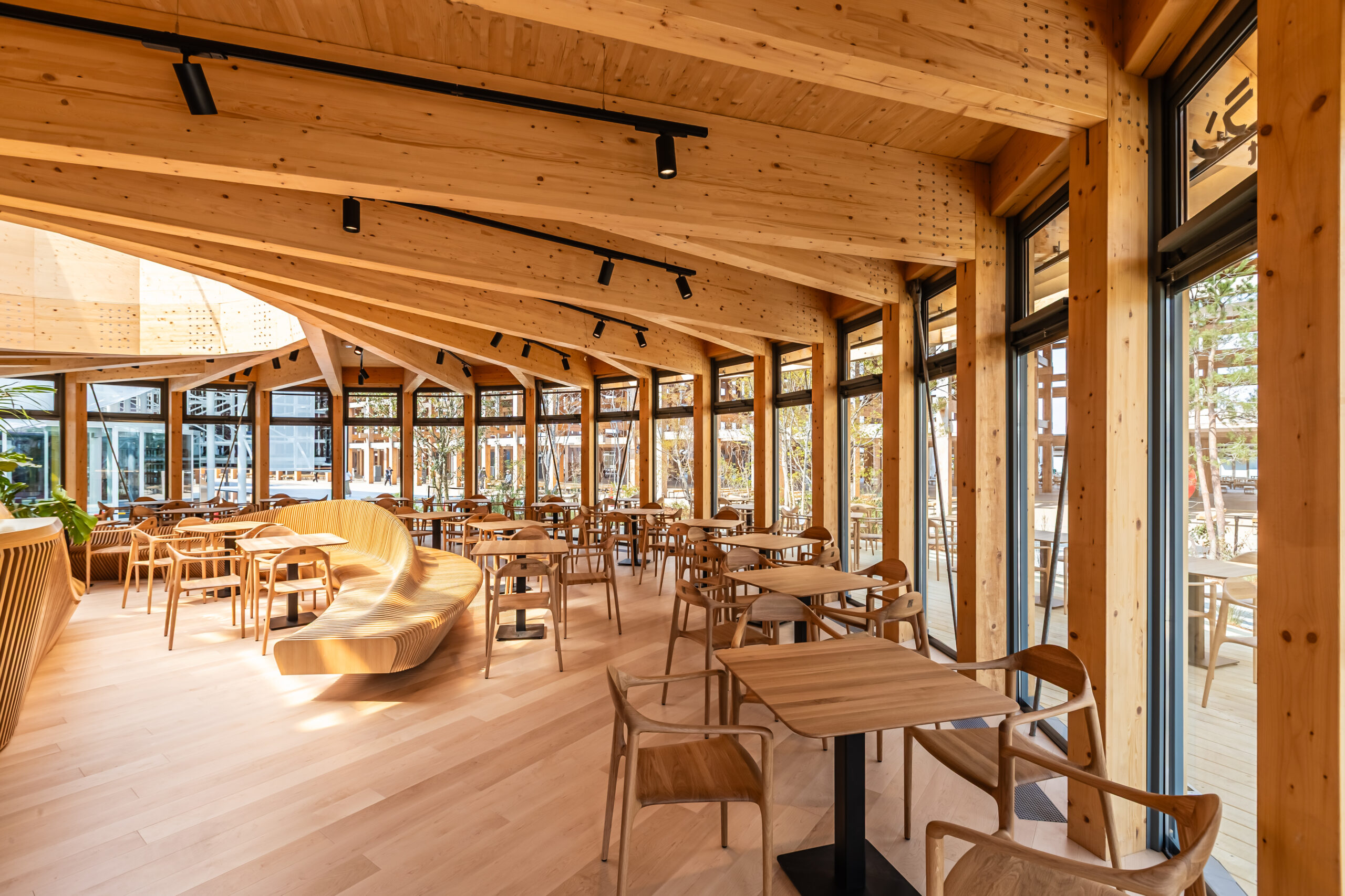
A client reviewing a photographer remotely cannot stand behind the tripod, but the evidence is in the portfolio. Open several images of one interior and look at door frames and window edges near the sides of the frame. They should be parallel to the picture edge in every image, not just the hero shot.
Three things make a first shoot efficient from a distance: drawings or a few phone photos of the space, the medium the images will appear in, and the one element that must read straight above all others. From those we propose which walls to face, which corners to shoot and which lines to align before the shoot day. Correspondence, estimates and delivery are in English, so the project can run from your office.
Working with Daisho Photography
Daisho Photography is an Osaka-based sole proprietorship photographing architecture and interiors, retail, hospitality and property, events and products across the Kansai region. Because this work is built one frame at a time, we book architectural and retail shoots by session length rather than image count. Send drawings or site photos and the intended use, and we will return a shot plan and session proposal.
Daisho Photography (sole proprietorship, Hotaka Matsumura)
Email: contact@daishophotography.com
Web: daishophotography.com